
When users are shopping on your ecommerce site, one of the most important aspects is what is seen last in the process — your checkout page. Of course, there are many things to consider when trying to ramp up or perfect your ecommerce checkout page, but fortunately, the process can be broken down into relatable parts that help make optimization pretty easy.
Why is Perfecting Your Ecommerce Checkout Is Important?
According to a recent study created by Geckoboard, 74.5% of ecommerce shoppers abandon a website after putting items in their cart. They point out that there are several reasons why customers may abandon ship, including:
- People expressed payment security concerns
- Shoppers had a poor user experience
- They failed to find a coupon code
- There were unexpected shipping costs at checkout
- They had to create a new user account
All of these reasons can be connected to the checkout experience that users have on your site, meaning there are some essential components to your checkout page that need to be present to make customers feel like completing a transaction. Ultimately your site needs to be (1) functional and easy to use, (2) secure, and (3) incorporate design elements that are user-friendly and aesthetically appealing.
Below explores these three elements a little further to understand how you can perfect your ecommerce checkout page and avoid losing prospective customers at this point in the checkout process.
Is Your Checkout Page Functional?
There are a lot of aspects that can make or break the functionality of your ecommerce checkout. In order to have a functional checkout, your process should be completely linear. According to a webflow article, you want things to flow logically and go in an ordered sequence during checkout. For example, you don’t want to have users re-directed to a previous step in the checkout process at any point. Therefore, your checkout needs to have a clear, ordered, step-by-step process that is simple and functional from start to finish.
Let’s take a look at an example.
When shopping on Anthropologie’s website, after completing your browsing experience, you are initially re-directed to your cart before the checkout process (see screenshot below):
Once you click the “check-out” button, you are first asked to log in, sign up, or enter your email to continue as a guest:
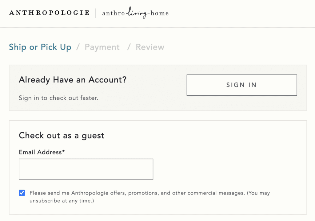
The design of this checkout is ordered and makes sense. Rather than taking customers through any steps before having them input information, they ask for this first to associate the cart with their account or get information from a new customer immediately.
Another aspect of having a functional and user-friendly site is ensuring that all fields are clear and labeled appropriately. You want to make sure that customers have an effortless time inputting all of their information. Of course, you can also add descriptions to anything that may not be immediately clear to the customer. In any case, you want to be sure that everything from their name, shipping address, and credit card information is easy to add and clearly labeled. Quite simply, this is one of the most important factors in optimizing your checkout process.
Does Your Site Appear Secure?
Security is the top priority for most online shoppers. People want to be sure that if they are providing you information related to their identity and credit, it is protected. But most people have no idea whether a site is actually secure from visual information, so it comes down to perception or gut feeling cues that are the only thing providing this evidence of security.
For example, in the mock fields below created originally by Smashing Magazine (but still relevant today!), customers perceive example B as more secure because of the GeoTrust seal being more closely connected to the payment information. Minor alterations can provide customers with the check-out security they desire, which will provide your site with more completed purchases.
Is Your Design Appealing?
There is a lot to be said for the appealing design and aesthetics of your checkout page. However, if people are turned away because your website is distracting, appears unorganized, or the color scheme just isn’t working, then this is something you want to make adjustments or considerations to ASAP. There are a few design elements to consider.
- A Progress Bar. People like to know where they are at in the checkout process. What step are they on? About how long will it take them to complete their purchase? By providing a progress bar, you resolve many of these questions, and people can stay on track with a visual guide.
- Item images. When people are shopping for multiple items, it helps to visualize the items they are about to purchase in their cart. By providing images, you give customers the peace of mind that what they are about to pay for is indeed what they want to buy.
- Color Scheme. Make sure the colors and layout you decide on work for your website. At check out, it is best to keep things clean (typically no bold colors) and simple. This allows customers to focus on essential aspects of check-out without feeling overwhelmed.
Final Thoughts
Once again, there are some fundamental things to check for in terms of checkout page optimization. Consider the following checklist to make sure you are on track for both checkout page usability and psychological triggers that people experience on a check out page:
Function
- Is all of your checkout information ordered logically and in a linear fashion?
- Are all of the instructions and descriptions on your forms clear?
- Are there any distractions that may prevent someone from completing checkout?
- Is the text big enough, and is the layout organized and clear to read?
Security
- Do you provide visual cues of security?
- Are these visual cues located in the best possible place?
Design
- Do you have a progress bar that is obvious and indicates where your customer is in the checkout process?
- Do you provide images, and are they large enough?
- Does the color scheme work, and have you considered all-important design aspects?
If you can make it through this final checklist, you are more than likely on your way to a perfected checkout page for your ecommerce site.