
Our main objective at Ten26 Media is to increase revenue for our clients. Whether it’s a brand, product, or service, our strategy is to convert the traffic we are driving to a specific website or pay-per-click (PPC) landing page at a high rate. The most effective way to accomplish this is by streamlining the journey a user takes from initial search to conversion and making it as natural as possible.
The landing page serves as the anchor of this journey – the place the consumer visits to convert, or to take the particular action our client wants them to.
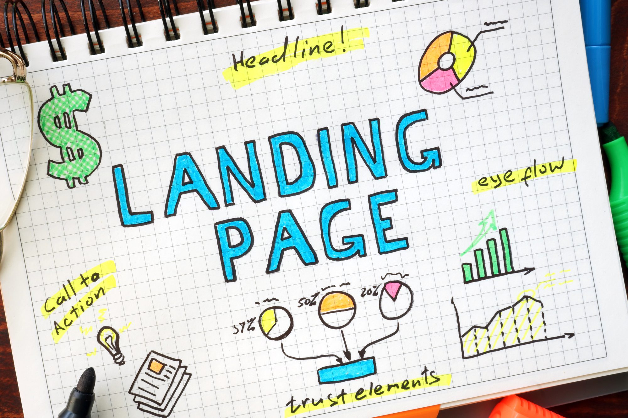
Sometimes people know what they’re looking for when they embark on a search adventure on the Google machine. And sometimes they need answers to questions they didn’t even know they had. The outcome of our landing page analysis and recommendations is a spicy (and successful) landing page that answers those questions. Here’s a peek at our process.
Start Here
Establish congruence between keywords, ad copy, and landing page copy. Creating a spicy PPC landing page begins with understanding which keywords you’ll be targeting and smoothly bridging the gap between a user’s search query and conversion. This means writing fresh and relevant ad copy to earn the click-through to your landing page. But there’s a lot more work to be done after you’ve driven traffic to the page.
If our client has an existing landing page tied to their PPC campaign, we begin with an in-depth analysis of the page. Oftentimes, we find that these pages are built without best practices in mind, simply because the client is unaware of them. This doesn’t mean that they’ve done everything wrong – we don’t always have to reinvent the wheel.
We also get a better idea of branding and desired look and feel when we have an existing page design and copy to work with. Taking a look at the existing page is a great starting point when taking on a new client in any capacity because of this.
Let’s get into our landing page analysis and recommendations process for a taste of that secret sauce.
We break down each key element of a spicy and successful landing page by describing the element or what we look for during our analysis. Then, we provide recommendations meant for conversion rate optimization (CRO) based on our findings. We’ll cover the most common recommendations we make to our clients and why they are important.
Headline
The elements at the top of the page are the first pieces of information that hit a user’s eye, which is why headline, subheadline, and hero shot placement is key. The purpose of the headline is to instantly confirm a user has come to the right place for the information they are seeking. It should contain the primary keyword. If possible, it should also express our client’s unique value proposition (UVP).
Recommendation
Most commonly, we find that headlines aren’t prominent on the page – they use small font size, are not bolded, are not centered or placed at the top of the page, or are not clear (because they are typed on an image and difficult to read, for example). We risk a consumer clicking away if they land on our page and can’t quickly spot a headline that grabs and maintains their attention.
SubHeadline
Next, the subheadline supports the headline and adds an element of persuasion. This is also our chance to share more about what the consumer can expect to see on the page. Sometimes, a headline can’t cover our client’s entire offer or UVP.
Here’s an example of a headline and subheadline we created for one of our clients:
Personalized Federal Employee Retirement Planning
Are you prepared to have the retirement you’ve always dreamed of?
Note the keyword “federal employee retirement planning” in the headline and the persuasive element in the subheadline, urging a consumer to utilize our client’s services so they can have the retirement they’ve always dreamed of. The way these two lines work together can be pretty powerful!
Recommendation
We make sure the subheadline appears directly underneath the headline as they create a stronger, unified message when placed together. We’ll sprinkle in some personalization by asking a thought-provoking question aimed at the consumer’s struggle that our client’s business can resolve. Personalization is the key to deeply connecting with the consumer and influencing conversion.
Hero Shot
The hero shot is an attention-grabbing element – usually an image – that further communicates the story to your consumer. Together, the headline, subheadline, and image provide a clear sense of the theme of the page upon scanning and are meant to maintain user engagement with the page.
Recommendation
The hero shot is an element we often find missing on existing landing pages we audit. Because we process visuals so much faster than text, an image is incredibly effective at quickly communicating information about the landing page. As a result, it’s important to choose a relevant, good quality image.
Explanation of Services
This one is self-explanatory (get it??). Generally, we want this section to succinctly yet sufficiently describe our client’s offering.
Recommendation
An explanation of services is not always necessary if a combination of the other elements on the page makes it obvious. But for more complex services, it’s best to elaborate.
This section may include product or service features. We are careful not to mix these up with benefits, which describe the actual value of the product/service to a consumer rather than simply describe the product/service itself.
Benefits List
A common landing page mistake is confusing features with benefits. The question you should ask yourself when creating a benefits list is, “How will this product or service solve a problem or fulfill a need for the consumer?” In other words, why should they purchase your product or service? How will it make their life better?
Recommendation
Features answer questions like, “What will the consumer get with the purchase of this product/service?” and “What are the highlights of the product/service?” Mastering the difference directly impacts CRO as we are able to connect with our target consumer over a challenge they are facing via a strong benefits list.
Social Proof
Another important element that helps boost CRO is social proof, which includes customer testimonials, product reviews, and badges/trust symbols to signify credibility. Studies have shown that consumers often make purchasing decisions based on other people’s experiences.
Recommendation
Social proof is important to include because It’s in our nature to look at what everyone else is doing. This information helps consumers understand what to expect if they were to engage in the same behavior (convert). It also acts like a shortcut in figuring out who/what to trust, so it positions our clients as having credibility. Using the real names and pictures of the reviewers is a huge plus. We never leave this element out if we can help it!
CTA Button
The anchor of every landing page is the call-to-action (CTA) button. A call to action is a word or phrase that nudges a customer to take a particular action or convert. We look at the design properties of this button and where it is located on the page.
Recommendation
In terms of CRO, this button should be BIG and a contrasting color from the rest of the page. We do our best to make it stick out like a gaper pizza-ing down a ski run in jeans so that it will easily attract the eye. Place the CTA button in at least two different areas of the page, one of them being at the top, typically right below the headline, subheadline, hero shot, and benefits list. Another great place is underneath the social proof.
Secondary Methods of Contact
While we don’t want to distract from the primary CTA, it can be a good idea to include additional opportunities for conversion on the landing page. If a consumer is looking to contact our client directly, we certainly want to ensure our client’s phone number is available and visible on the page.
Recommendation
A clickable phone number and email address in the header and either sidebar or footer gets the job done. That way, consumers have the option of contacting our client for more information, which makes sense if their product or service is a big-ticket item with a longer customer journey to conversion.
Page Speed
All elements should be optimized for a quick page load time. Have you ever gotten so frustrated with how long it was taking a page to load that you exited without giving it the chance? Studies have found that users will click away after three to five seconds.
Recommendation
We always make sure to optimize for page speed. The best way to do so is to avoid using too many images or videos, which can significantly slow down a page. Also, make sure all images are compressed before uploading them to the page.
Final Thoughts
The most important thing to keep in mind as you’re creating your landing page is that you’re doing this for your ideal customer, so all elements should be tailored as such. Think about what you would like to see on a landing page if you were the user. The landing page experience helps determine keyword quality score for a reason, and taking shortcuts when creating a landing page is like not finishing your beer: a below-average effort that leads to wasted money.